Graphic Identity
The marketing and communication team uphold and strengthen the Radford University brand. We are the storytellers; the bridge between our academic excellence and the outside world. Through well-crafted messages and visually appealing design, photography and videography, we ensure the Radford University brand remains a beacon of quality and credibility.
Our new Graphic Identity
While the brand transformation unfolds over the next 12-18 months, we kindly request that you continue to use your current materials with the former brand word mark until they run out. Below is a button link to our brand roll out schedule outlining the expected release dates for new brand assets. We sincerely appreciate your patience and understanding, and please note that you might see see occasional updates to the roll out timeline.
Brand Guide
The Radford University brand guide is a strategic resource to ensure consistency in all university communications, both internal and external. The brand guide sets clear standards for logo use, color schemes, typography, textures and graphic elements. It also provides direction on how to convey the university's values and messages, helping maintain a cohesive and compelling narrative for all stakeholders.
The brand guide may be occassionally updated, so please check back frequently. After reviewing the guide, additional questions about the brand may be directed to branding@radford.edu.
Below are highlights of some of the key assets that make Radford University's brand distinct.
Brand Pillars
Brand pillars focus on what Radford University delivers, the value it offers and the characteristics that make it distinct. These pillars are like chapters of our brand story.
- Excellence that is easily accessible
- Centered on those we serve
- Freedom to learn from experience
- Active learning and active doing
- Ready for all life's roles


What we say and how we say it
Radford University is where students discover their true potential. They find possibilities everywhere: on campus, in classrooms, by joining clubs and through experiential and educational opportunities. Students are provided the space, place and guidance to become successful in their professional and personal lives.
Our brand represents a storytelling voice. It is genuine and real, as well as friendly and enthusiastic. It shares student, faculty, staff and alumni personal journeys and triumphs without ever being boastful. Our voice pivots as needed and can be more formal or casual to align with the use-case.
Writing Style
The Associated Press (AP) Stylebook is the standard style guide for most U.S. newspapers, magazines and public relations firms. Radford University's marketing and communication team bases its writing style on AP, with a few preferences and exceptions.
University Logo
The main university logos are available for download. Use should conform to the guidelines in the brand guide or the condensed logo guide included in the core logo ZIP file. Use of the logo outside of the university system must be pre-approved. Request to use the logo through branding@radford.edu.
Typography
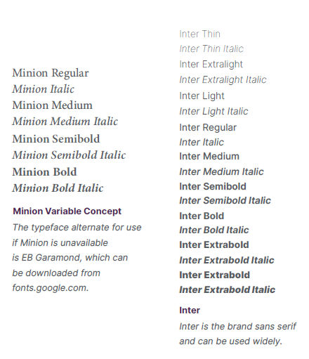
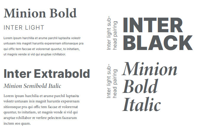
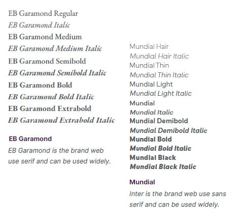
The Radford University brand pairs the traditional serif Minion typeface with the modern sans serif Inter. Minion is an Adobe font that can be activated with Adobe Creative Cloud, and Inter is a Google font available for free at fonts.google.com. In addition to Minion and Inter, Radford University employs Mundial for web use. When the redesigned Radford University website launches in 2024, it will also include EB Garamond for web use.
Primary Typefaces
Font Pairings
Web Typefaces
Color
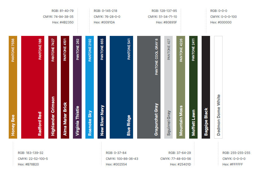
Color plays a pivotal role in conveying identity and evoking emotions. Our Radford Red symbolizes tradition, strength and energy, making it a memorable, distinctive choice. Our accompanying colors complement our Radford Red and amplify the brand's identity, enriching our story with depth and versatility.
Primary Colors
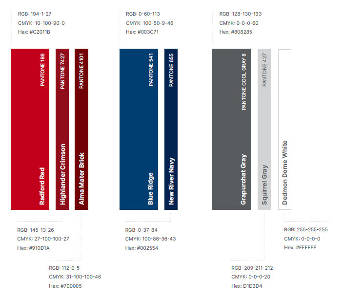
Full Color Palette
The Meaning of the Brand Elements Explained
1910 represents the founding of our institution.
The "R" represents our prestigious institution.

The mountains represent – place – where we live, learn and work. The mountains are our classroom and our playground. From the blue ridge mountains, mill mountain, draper mountain and other peaks and valleys as our backdrop – this is where we call home.
The wayfinder acknowledges those who have found their way here. And beckons future generations to do the same and make their mark here.

The shield – battle tested, strong, resilient, a container and representation of our close and tight knit community. The lines of this shield holds us together. It represents the safe place we provide for others to explore and fail, learn and become resilient. But also know that nothing can contain us or the potential we have as a community.
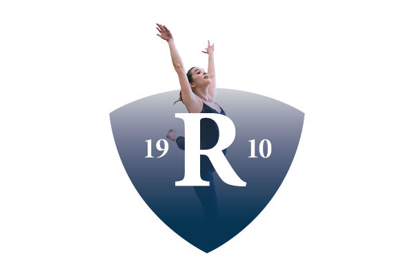
The flexible logo shows we are boundary breakers and our success and compassion still comes through. This logo represents the diversity and breadth of the excellence of our programs and the service we offer to our community.
PowerPoint Template
The Radford University PowerPoint template is available for download for official university use.
Zoom Backgrounds
Download our latest Radford University Zoom backgrounds to enhance the quality and professionalism of virtual meetings and presentations.